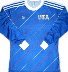
JR’s Top 5 USMNT kits

JR Francis is the Chief Marketing Officer for Atlanta based soccer supporters group Terminus Legion.  As an avid collector of sports gear, he wanted to share his top 5. You can follow him on twitter @paynomind.

#5

2003 Third

11219889944_368ce22b98_m

The best part of this kit is the logo. That should be our permanent crest, or some version of it. I like the sash and think we should make that an American thing. I don’t care for the sash going underarm to hip. I think it should go from shoulder to hip. That’s the only problem  have with this one.

#4

1983 NASL Team America

84ta
Beautiful, distinctive stripes. Navy shorts and collar. Love collars on jerseys. This would be amazing to see in modern fabrics.

#3

2010 Away

2010 us away

I could dig this as a solid entry for them to always come back to. The white sash is very bold on the navy. The red as an accent is the perfect amount.

#2

2012 Home

2012 us home
I think the Waldo name is affectionate. I love the ghost stripe sash. I’m furious at myself for not owning one of these. What you want in a jersey is to have anyone flipping channels to immediately be able to identify the country. This jersey does it better than any other.

#1

All three 1995 jerseys

1995-usa-home-597x448
95 away
95blue
If there came a rule that said there could only be one national team jersey until the end of time, this is what I would pick. Just gorgeous, distinctive, American. The number in the center front was dope, and I wish all replicas had SOME number there.
——

Many thanks to the following blogs:

Project 2010.  Their post on US kits, which opened my eyes to the history of USMNT kits, was the inspiration for this project.  Follow them on twitter at @project2010usa.

Chariots of Fire Sport Blog. This blog covers sports in general and the post on US kits was informative and helpful in the formation of this blog.

Contributor Gianpy Belaunde has an amazing set of photos on instagram.  We used a couple in our posts and for reference.

Top 5 USMNT Kits

So we’ve reviewed the last 3o years of USMNT kits and have picked out our top 5.  Here we go . . .

Austin’s Top 5

#5

2000 Home

I really like the 2000 kits.  Simple v neck collar and a solid color for each shirt.  With the modern trend towards a tight fit (and if I bulked up), I think this could have crept into the top 5.

#4

2010       Away

Top five for sure.  Navy blue.  Check.  White sash that contrasts nicely with the rest of the shirt.  Check. I own this one, have it personalized (Junior #7) and wear it a lot.  Love it.

#3

2008 Away

Love the charcoal color.  Out of the ordinary and looks great with the accented red hoop collar and white shorts.  From time to time you’ve got to change things up.  Wouldn’t mind this as a third shirt in the future.

#2

2006 Home

11219917455_37fe7bd759_z

Crisp white jersey with ring collar, vertical bands of red and blue that reflect the US flag, and navy blue shorts.  Fantastic.  Imagine this kit with the centennial crest.

#1

2013 Centennial

The combination of something old, something new and something clean creates Nike’s best effort for the US National team.  The badge is shield reflecting the US flag and previous incarnations; the fabric and looks are entirely modern; and the navy blue v neck and accents on the sleeves make this a shirt worth having.


Tyler’s Top 5

#5

2006 Third

#4

2004 Third

#3

2010 Away

#2

2006 Home

11219917455_37fe7bd759_z

#1

2013 Centennial

——

Many thanks to the following blogs:

Project 2010.  Their post on US kits, which opened my eyes to the history of USMNT kits, was the inspiration for this project.  Follow them on twitter at @project2010usa.

Chariots of Fire Sport Blog. This blog covers sports in general and the post on US kits was informative and helpful in the formation of this blog.

Contributor Gianpy Belaunde has an amazing set of photos on instagram.  We used a couple in our posts and for reference.

We hope that you enjoy our thoughts and please visit our About the Writers page to learn about our individual projects.

USMNT Kits 2010-2016

2010       Home

Austin:  Grade   B+

The new interpretation of the sash trend begins with this shirt.  Chariots of Fire takes the go big or go home approach but I like that it is subdued, with a just a hint of visibility.

Tyler:  Grade B

Solid shirt for the 2010 World Cup. Love sashes, even when they are only slightly visible. In summary, a good kit outdone by it’s other color variation.

2010       Away

Austin:  Grade   A

Top five for sure.  Navy blue.  Check.  White sash that contrasts nicely with the rest of the shirt.  Check. I own this one, have it personalized (Junior #7) and wear it a lot.  Love it.

Tyler:  Grade A-

Great shirt. The navy with a white sash looks great, and it gets bonus points as the first shirt I ever owned.

2011       Third

Austin:  Grade B

Again with the checklist.  Red.  Good.  Sash.  Ok.  Navy blue shorts and red socks.  I’m conflicted because I should like this strip but for some reason don’t.  Decent effort.

Tyler:  Grade B

I like the red better than the white home shirt, but both are fantastic. I believe that this shirt could have been better with some slight modifications though.

2012       Home

2012-13 USA Nike Home Football Shirt

Austin:  Grade C+

Not so affectionately referred to as the Where’s Waldo shirt, I can see where Nike was going.  Wonder what it would have looked had the stripes gone vertical rather than horizontal.  As the Chariots of Fire post notes, there is a subtle sash, which I didn’t even know was on the shirt until I saw it in person. Too much!

Tyler:  Grade B

This shirt grew on me as time past and it looks really good with the box cut out for the front numbers and the back. The good run of form from 2012 to 2014 for the USA also gives this bonus point in my book.

2012       Away

Austin:  Grade C

The sash fad continues and I really don’t what Nike was trying to accomplish.  I suppose an amalgamation of retro US kits with a homage to the Arsenal home shirt highlighted by a very busy collar.

Tyler:  Grade B

I like the collar and the white sleeves. I think it’s a good continuous from the 2010 World Cup shirt, but not quite as good. To go along with my bonus points theme, Mix Diskerud scored his first goal against Russia wearing this shirt.

2013       Centennial

Austin:  Grade   A

The combination of something old, something new and something clean creates Nike’s best effort for the US National team.  The badge is shield reflecting the US flag and previous incarnations; the fabric and looks are entirely modern; and the navy blue v neck and accents on the sleeves make this a shirt worth having.

Tyler:  Grade A

Simplicity at it’s finest. The large centennial crest is great enough to make anything look good. Like Austin said, the navy neck and sleeves are great details. I know the crest was made specifically for 2013, but man imagine how good something like this could look for the United States in the future?

2014       Home

Austin:  Grade   C


I really don’t like this jersey.  (As a point of clarification, I’m a hater.)  If you have been following the review of jerseys, then I think it’s fair to say we have gone 30 years and come back to the same spot.  A very plain shirt (border line golf or polo shirt), a crest that is better than years past but with the lighter blue (or as Footy Headlines described it as “luscious blue“), and nothing distinctive. In the end, this shirt is a built in invisibility cloak.

Tyler:  Grade B-

I’m in the minority of people who think this shirt is pretty decent. The horizontal pin stripes are a small overlooked detail that I like. The small change to the color of the US crest is refreshing, but with many still calling for a totally new change it doesn’t help the fans opinion. Compared to the rise in quality shirts for the USA in the past, it’s a let down. However, it is not awful.

2014       Away

us 14 away

Austin:  Grade   B-

Saw the leaks in the lead up to the release and was hoping against hope that they true.  Alas, Nike has produced a nice merchandising link to Captain America: TheWinter Soldier. That or the jersey is an attempt to boost Bomb Pop sales.  Despite all this I do like the monochromatic crest, which seems to be a recent addition to several manufacturer’s bag of tricks.

Tyler:  Grade B-

Disliked this upon the first leaks, but it looks a lot better in person/on the field. However, like I said on the home kit, it’s a letdown after the latest kits in my opinion. While the USA’s World Cup shirts aren’t a failure, they still leave me wishing for something more. Not good, not bad, just solid.

2015       Away

us-2015-away

Austin:  Grade   C-

Where do I start with the current away kit? The fact that we are still using an outdated crest with stars of no particular importance? The fact that the shirt uses royal blue which is significant because. . . it was used in the 80’s? The fact that icing belongs on cake not on top of performance designed equipment for world class athletes?

2016       Home

usa-2016-copa-america-home-kit-4

(Image courtesy of Footy Headlines)

Austin:  Grade   C-

There’s a lot going on here, with the new crest and the new template from Nike. At some point I may fully develop my thoughts, but for the point of this exercise, white home shirt makes sense but the sleeves look terrible up close, yet not so bad from far away. Will be interesting to see how this translates on TV. Still upset that Nike can’t use the colors of the flag especially when it’s right there on the new crest.

2016       Away

usa-2016-copa-america-away-kit-1

(Image courtesy of Footy Headlines)

Austin:  Grade   C-

Every sporting brand has to have a black jersey. The US finally got on the bus and . . . missed. Sleeves of different colors has created the nickname of the cop car on the interwebs. The appearance of a training shirt takes away from the importance of the strip, and in the end, my takeaway is that this looks like the uniform for an upcoming Hollywood comic inspired superhero team blockbuster. And that’s not a good thing.

——

Many thanks to the following blogs:

Project 2010.  Their post on US kits, which opened my eyes to the history of USMNT kits, was the inspiration for this project.  Follow them on twitter at @project2010usa.

Chariots of Fire Sport Blog. This blog covers sports in general and the post on US kits was informative and helpful in the formation of this blog.

Contributor Gianpy Belaunde has an amazing set of photos on instagram.  We used a couple in our posts and for reference.

We hope that you enjoy our thoughts and please visit our About the Writers page to learn about our individual projects.

USMNT Kits 2000-2008

2000 Home

Austin:  Grade B

I really like the 2000 kits.  Simple v neck collar and a solid color for each shirt.  With the modern trend towards a tight fit (and if I bulked up), I think this could have crept into the top 5.

Tyler:  Grade C

Decent kit. Simple and clean, but nothing special. I like the collar of the kit.

2000 Away

Austin:  Grade B

The collar really pops on this one and I like the contrast with the navy blue shorts.  I agree with Project 2010’s comments: “there’s nothing distinctive” for this round of jerseys but sometimes that’s a good thing.

Tyler:  Grade B

I think the red works a lot better than the white. Good solid away kit, once again I’m a sucker for a red away kit.

2002 Home

Austin:  Grade C

This Nike template was awful.  Brazil, Nigeria, the US and other clubs and countries were victims of sharp angles and weird below throat patches.

Tyler:  Grade C+

I think this kit looks okay. I agree with Austin about the odd angles, but I feel like this was still a solid kit compared to some in the history of the United States.

2002 Away

Austin:  Grade D+

The shirt looks like a training kit and that’s not a good thing.  That pic of Clint Mathis, the swashbuckling redneck, is not helping matters.

Tyler:  Grade C-

Simple kit. Nothing good about it really, but nothing that offends me.

2003 Third

Austin:  Grade B-

I can’t remember every seeing the 2003 third kit.  As the 2010 Project post mentions, this a semi-throwback to the 1950 World Cup (issuing it 2003 seems weird to me) and the sash appears to be drooping rather than being sharp and bold from the top of the shoulder.

Tyler:  Grade B+

I love this shirt. I love the throwback look and Nike did justice with this. A fresh look at the US Soccer crest and a sash combine for a great shirt.

2004 Home

Austin:  Grade   B+

I own this one and liked this template in general.  I have the long sleeve version and the cuffs are very minimal which does not allow it to stretch out.

Tyler  Grade: C

Once again just a decent kit, I don’t really like the circled numbers, but it does give it a bit more character.

2004 Away

Austin:  Grade   B

I think the away shirt could have cracked my top 5 had the piping been navy blue or white rather than red.  Just doesn’t look right.

Tyler:  Grade C+

I think the away looks better than the home, but still not near one of my favorite kits.  Having name and numbers on these kits is a must.

2004 Third

Austin:  Grade   B-

Similar thoughts as the 2003 third shirt.  Prefer the red band but still looks like it was thrown on as an afterthought.

Tyler:  Grade A-

Love this shirt, better than the similar 2003 third kit. The red sash on white is a great.

2006 Home

11219917455_37fe7bd759_z

Austin:  Grade   A-

Crisp white jersey with ring collar, vertical bands of red and blue that reflect the US flag, and navy blue shorts.  Fantastic.  Imagine this kit with the centennial crest.

Tyler:  Grade A-

Another great kit. A simple, but classic white shirt. It shows that you can have a simple shirt with a couple simple details and make it great.

2006 Away

Austin:  Grade   B

Call back to the mid-90’s with slight modifications.  I find myself liking this version much better and would pick it up if I found it on the cheap.

Tyler:  Grade B

A huge, modern improvement on the 1995 kits. This set of 2006 shirts is one of my favorites. I like the larger US Soccer crest that is on these shirts.

2006 Third

Austin:  Grade   B

This shirt is the transition between the retro sash and the sash of the future.  The sash starts higher, which I like, and the red of the shirt is appealing.  Collar is a little busy and floppy though.

Tyler:  Grade A-

Another one of my favorite shirts. Another red shirt, but with a great white/black sash and the retro US Soccer crest.

2007 Third

Austin:  Grade   C-

Awful.  The blue is odd and I hate the pinstripes.

Tyler:  Grade C+

Okay shirt, it’s different and I think with some modifications a pinstripe look could have worked for the United States here.

2008 Home

Austin:  Grade   C+

Meh.  After years of looking at this one, I’m still undecided on the collar.  The broad horizontal stripes with red accents really don’t do it for me.

Tyler:  Grade B-

I like this shirt. Has just enough going on to be a solid kit. I really like the inside of the collar on the 2008 kits as well.

2008 Away

Austin:  Grade A

Love the charcoal color.  Out of the ordinary and looks great with the accented red hoop collar and white shorts.  From time to time you’ve got to change things up.  Wouldn’t mind this as a third shirt in the future.

Tyler:  Grade B

Another solid shirt. Although it is pretty plain and simple, the use of a different color provides some new excitement and works well.

——

Many thanks to the following blogs:

Project 2010.  Their post on US kits, which opened my eyes to the history of USMNT kits, was the inspiration for this project.  Follow them on twitter at @project2010usa.

Chariots of Fire Sport Blog. This blog covers sports in general and the post on US kits was informative and helpful in the formation of this blog.

Contributor Gianpy Belaunde has an amazing set of photos on instagram.  We used a couple in our posts and for reference.

We hope that you enjoy our thoughts and please visit our About the Writers page to learn about our individual projects.

USMNT Kits 1984-1998

1984       White

Austin:  Grade   F

Not a good place to start as this shirt is awful.  A very basic template ruined by the diagonal pin stripes.  Plus the USA on the chest is so low rent.

Tyler:  Grade F

Agree with Austin on this one. Just bad from top to bottom, nothing really left to say about it.

Gianpy: Grade D-

Do think the jersey template and colors are terrible, but something about the simple USA logo gets me. My OCD also hates the poorly aligned Adidas logo on the left. Nothing memorable.
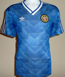
1984       Blue

Austin:  Grade   D-

Ugh.  So plain, so ugly.  Just a NO all around.  When reviewing this shirt, I remembered that the Germany Euro 2012 home kit brought the diagonal pinstripe feature back.  Not sure if that’s a good thing.

Tyler:  Grade D

The blue away kit is a bit better. The white home just looks very cheap, but the blue pulls it up a little. The shirt also looks better with long sleeves. Anyone who complains about the current US Soccer crest just needs to look at the shirts from 1984.

Gianpy: Grade D

As Tyler said, this is a step above the White version. While it isn’t pleasing to see the use of this template, the United States probably did not deserve a custom jersey in the 80’s.

1984       Red

Austin:  Grade   D

Who knew that third kits existed in 1984?  My comments about the other 1984 shirts combined with the all red strip make this an eye sore.  And don’t forget the John Stockton nut hugger shorts as well.

Tyler:  Grade D-

Once again, kit isn’t very great. I think the blue away works more than the third, but either way all three kits are bottom line.

Gianpy: Grade D

Similar feelings to the blue jersey, the color adds to the jersey and makes it better than the White version, but the plain look and feel remains.

1988       Home

Austin:  Grade   C-

Decent but nothing special.  Not sure how I feel about  the accents over the collarbone, and the badge screams 1980’s youth soccer, with bare penalty areas, taped up nets in the goals and orange slices at half time.

Tyler:  Grade D

First off, an actual crest is a huge improvement, but this shirt is easily forgettable and most people have never saw it before for good reason.

Gianpy: F

Hideous. The improvement on the logo is helpful, but the collar and longsleeve look doesn’t do it for me. This is even worse than the 1984 White jersey, as it only uses white and aquamarine blue accents.

1988       Away

Austin:  Grade   D

Not as bad as the Manchester United away shirt from the early 90’s but bad.  Sublimated images and weird design just make a plain jersey effin terrible.

Tyler:  Grade D+

Not going to lie, I like this shirt. The crest really pops. Like Austin said, most people will hate the design on the shirt, but I don’t really mind it.

Gianpy: Grade D

Bleh. While the template’s design isn’t all that bad, I’m not a fan of that shading of blue.

1990       Home

Austin:  Grade   D+

The shirt takes future US shirt elements (V neck collar, pin stripe across the chest, centered crest) and makes a complete hash of it.  Add the short shorts and the result is a traveshamockery.

Tyler:  Grade D

I’m not a big fan of the crests centered and especially not as low as they are in this shirt. However, compared to the first kits on the list it’s a big improvement and a turn for the better.

Gianpy: Grade D-

The way everything is positioned on this jersey reminds me of the 2004 Home/Away jerseys, with the manufacturer’s logo on the top left and the logo front and center. I find the placement of the blue accents to be weird, with thick bars on the shoulder areas and thin lines across the chest.

1990       Away

Austin:  Grade   D

And it gets worse.  What’s happening in the armpit area?

Tyler:  Grade D-

The crest is in a better position than the home, but other than that, this shirt is a mess.

Gianpy: D+

The lighting on this image makes the jersey look worse than it is in person. While the template is horrendous, the blue color goes well with the crest.

1992       Home

Austin:  Grade   C

I really like this template and remember it fondly from the early 90’s.   The home strip does just enough.

Tyler:  Grade C-

Best shirts so far by far. New US Soccer crest. Think it would look better without the stripes on the shorts.

Gianpy: D+

The redesigned US Soccer logo saves this jersey, as the 3 colored stripes seem more of a way to market Adidas’ trademarked logo.

1992       Away

Austin:  Grade   C+

The blue is not quite right and the bulkiness of the shirt, especially in the sleeves, does not help matters, but upon taking a second look, I actually prefer this one to the home.

Tyler:  Grade C-

The away shirt uses the same template and it looks fine too, but nothing more than that.

Gianpy: B

Despite what I said above, this one looks fairly decent to me. The combination of the darker blue jersey with the pearly white nameset goes well.

1994       Home

Austin:  Grade B

The World Cup 1994 kits are the subject of a lot of derision but adidas made an American Jersey for the American World Cup.  For instance Scotland did a tartan shirt for Euro 1996 and Manchester United is trying something similar with recent releases.  These shirts scream ‘Murica! and took the standard vertical stripes and created a flag.

Tyler:  Grade B+

HUGE leap forward in the currently nonexistent kitnerd standard. Fantastic shirt for the 1994 World Cup and I would personally love to see something similar to this again in the future.

Gianpy: Grade C-

While this one scores points for originality, the collar and shoulder hems look terrible. The jersey definitely screams “AMERICA”, which gives it bonus points.

1994       Away

Austin:  Grade C

Not as good as the home shirt.  A denim look was used for this shirt and captures a specific moment in American soccer.

Tyler:  Grade C+

This infamous denim kit has risen to cult status and people’s opinion of the shirt are inflated. The shirt was nice in a tacky, ugly way. You can’t deny that this is an iconic shirt though.

Gianpy: Grade B-

Nostalgic. This one is extremely popular amongst US Soccer fans simply because of its iconic American look (and feel!). I wouldn’t be caught wearing this except for on gameday and the Fourth of July, but on those days, it is the perfect kit.

1995       Home

Austin:  Grade C+

The mid-90’s saw the transition to Nike who, as the Project 2010 post rightly mentions, “changed the color palette. . . Both the red and blue are darker than on previous jerseys.”  The bands across the chest gave the Nike kits a good foundation moving forward.

Tyler:  Grade C

The first US Soccer Nike kit of the 90s. I personally love the band across the front, but I think it works even better on the away shirt.

Gianpy: Grade D

Nike’s first attempt at outfitting US Soccer was rough. While a step above Adidas, the 1995 Home jersey left a lot to be desired.
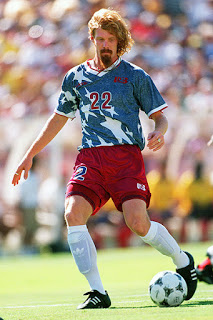
1995       Away

Austin:  Grade B-

I’m a big fan of navy blue so prefer it to the white.

Tyler:  Grade C+

Once again, the band looks good on these set of shirts and even better on the navy. A good solid shirt.

Gianpy: Grade B-

Something about the blue makes this jersey so much better than the Home version, but it might just be Balboa wearing it.

1995       Third

Austin:  Grade D

The third jersey is a horrible color.

Tyler:  Grade D-

This shirt is just ruined by the light blue, would have much rather saw a red third kit.

Gianpy: Grade C

Without a nameset, this one is bad, but having the original stitched nameset on the jersey adds quite a bit to it. The way this template was designed led to the US Soccer logo replacing the front numbers on the replica jerseys.

1998       Home

Austin:  Grade B

The kits for the 1998 World Cup are decent.  The thinner accent higher up the chest is a nice touch although I would not have gone all the way onto the sleeves.  The home version is a solid kit, and, with the slight design change mentioned above, this could have gone higher.  Not helping the cause is the sizing of the shirt which made it look like the sail of an America’s Cup boat.

Tyler:  Grade B-

I like the nice simple design of this shirt. The thin strip across the chest gives just enough detail to make a good kit.

Gianpy: C

Similar to the 1994 Home jersey, the collar and shoulder hems ruin the jersey. However, t he combination of the contrasting nameset with the similarly colored chest stitching makes this an okay jersey.

1998       Away

Austin:  Grade B

Like the red shirt but unfortunately it will be upstaged by the 2000 offering.

Tyler:  Grade B

I like the red away shirt more than the home. Either way, Nike gave the US National Team two good shirts for the 1998 World Cup.

Gianpy: Grade C+

Tad better than the home jersey simply due to the red/white/blue colorway which shows all 3 colors brightly.

——

Many thanks to the following blogs:

Project 2010.  Their post on US kits, which opened my eyes to the history of USMNT kits, was the inspiration for this project.  Follow them on twitter at @project2010usa.

Chariots of Fire Sport Blog. This blog covers sports in general and the post on US kits was informative and helpful in the formation of this blog.

Contributor Gianpy Belaunde has an amazing set of photos on instagram.  We used a couple in our posts and for reference.

We hope that you enjoy our thoughts and please visit our About the Writers page to learn about our individual projects.

Kick Off

In my internet wanderings, I came across a post on the Project 2010 blog that laid out the history of USMNT kits from the 80’s until the 2010 World Cup. Loved the comments and pics and vibe of the post, and it got me thinking that I would love to do the same thing. I jotted down some thoughts over time and finally decided to give it a go.

I contacted Project 2010 and they heartily supported my efforts. But why should I have all the fun? I reached out to fellow #KitNerds across the web and we have all contributed to this site. This project was a joy and we hope that enjoy our efforts.

Austin Long, Editor of USMNT Kits blog